
← ALL WORK · CASE 13
GOFLYNT
Hotel discovery, booking journeys and travel rewards for the Indian market — dense product designs turned into a frontend that stays clear on every screen size.
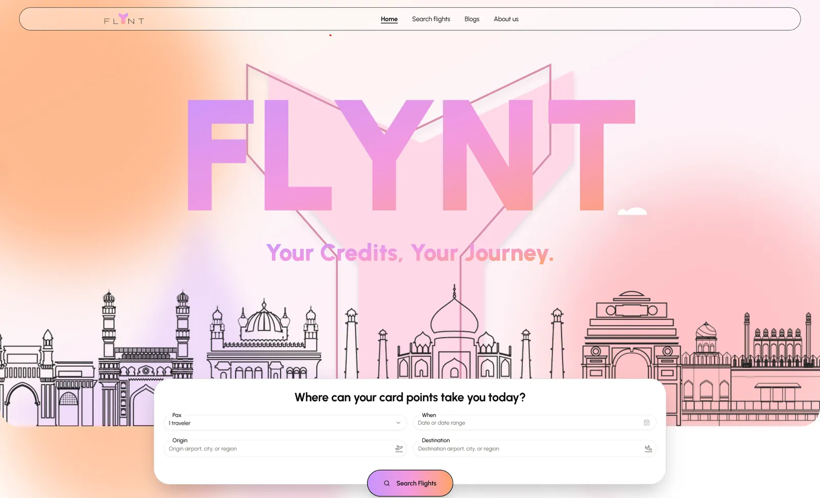
BOOKING JOURNEY — EVERY TRIP WALKS THIS PATH
LAYOUT BREAKS AT A BREAKPOINT → COMPONENT FIXED ONCE → EVERY PAGE INHERITS IT
01 — WARP
What had to be true first
Travel products drown users in information — hotels, destinations, dates, rewards, prices — and the designs for GoFlynt were correspondingly dense. The warp was an interface hierarchy: reusable components and structured page layouts in Next.js, React and TypeScript that could carry that density without collapsing on a phone.
02 — WEFT
What we wove through it
Onto that structure went the journeys: hotel discovery organised so exploration doesn't become scrolling, booking-focused flows that guide rather than decorate, and the rewards layer woven through the experience without burying the core action of finding and booking a room.
03 — BEAT
How it was pressed tight
Fidelity was the beat: Figma translated accurately rather than approximately, Tailwind layouts verified across desktop, tablet and mobile, and every repeated pattern extracted into a component so a fix lands once and every page inherits it. TypeScript keeps the frontend honest as it grows.
04 — WEAR
Life in production
GoFlynt India shipped as a responsive, maintainable frontend foundation — the design intent preserved in code, the journeys consistent across devices, and a component architecture the next feature can build on instead of around.
NEXT CASE — 14
EDUVISA →